
- SHOP All
- SALWAR KAMEEZ
Style
Occasion
Colors

- GOWNS
quickstop

- LEHENGAS
Style
Occasion
Colors

- SAREES
Style
quickstop
Colors

- KURTIS
- KIDS
- BRIDAL LUXE
- IN-STORE LIVE
- VIRTUAL SHOPPING

CAMPAIGN 2024


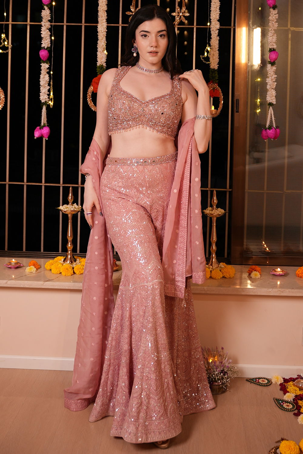
FESTIVE FAVOURITES


BEST SELLERS


-min.png)


BOOK A VIRTUAL
APPOINTMENT


Plaza Asiad, Ground Floor, Junction Of S.V Rd And Station Rd, Santacruz (West), Mumbai 400054, Maharashtra
Visit Our Store
